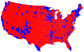
This image is a political pole by county on republican vs. democrat. Two color schemes to represent opposite data
http://www.nytimes.com/interactive/2008/09/04/business/20080907-metrics-graphic.html
This link is a really cool interactive bivariate choropleth on world spending.
No comments:
Post a Comment