Monday, July 27, 2009

Correlation matrix

          C1       C2       C3       C4       C5       C6       C7       C8       C9      C10
C1 1.000
C2 0.274 1.000
C3 -0.134 -0.269 1.000
C4 0.201 -0.153 0.075 1.000
C5 -0.129 -0.166 0.278 -0.011 1.000
C6 -0.095 0.280 -0.348 -0.378 -0.009 1.000
C7 0.171 -0.122 0.288 0.086 0.193 0.002 1.000
C8 0.219 0.242 -0.380 -0.227 -0.551 0.324 -0.082 1.000
C9 0.518 0.238 0.002 0.082 -0.015 0.304 0.347 -0.013 1.000
C10 0.299 0.568 0.165 -0.122 -0.106 -0.169 0.243 0.014 0.352 1.000


This is an example of a random correlation matrix. These are common in scientific studies. There are two triangles in a correlation matrix
but that would be redundant to add since they are mirror images of one another.

Sunday, July 26, 2009

star plot


The star plot is used to map statistical data. It could have many points on it that represent particular pieces of data in a set. Very useful for find a vehicle or home with specific option that one would require.

stem and leaf plots


Stem and Leaf Plots help you to find medians, figure out totals, and modes. I personally don't care for them and find them a bit confusing but the statistics people seem to really like them.

Box Plot


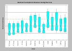
I got this box-plot from http://www.krisweb.com/stream/habtyp.htm. I know it is difficult to see here but the explanation is the maximum and minimum depths of a variety of streams in the area in order to be suitable habitats for certain species of fish.

Histogram


I scanned this histogram from the National Geographic "Atlas of North America". The histogram is from 1985 so it might be a hair out of date but I think it is still a good representation of the information that is being conveyed.

Parallel coordinate graph


The airplanes will be represented with three broken lines connecting the X, Y, Z positions of each airplane. In addition, a fourth parallel coordinate representing time is provided. (We will show only three times associated with the initial time and the times the red airplane appears to cross the trajectories of the other two.) Y-axis values represent some physical position and time measures. I found this at http://www.caip.rutgers.edu/~peskin/epriRpt/ParallelCoords.html

triangular plot


This is a standard triangular plot of the relationship between clay, silt and sand. This plot shows how grainy or fine the composition of the dirt is.

Windrose


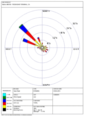
This Image is from Fresno, Ca airport. It is obvious that the winds are prevailing strongly to the NW. In the image below however, LeGuardia airport, the wind directions seem to be all over the place. They do prevail a bit to the south but otherwise a huge range of wind directions.
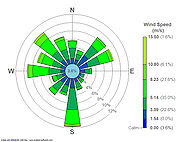
This is a windrose is from LeGuardia airport

Climograph


This climograph was also taken from "The Good Earth" text. It shows the relation between temperature and rainfall throughout the year. The blue lines indicate mean highs and lows.

scatterplot


This H-R map is an example of a scatter plot that judges the age of solar systems. This particular one is our solar system with our sun on the main sequence. I scanned this image from an Astronomy text by McMillan and Chaisson.

Population profile


This is just a different angle of looking at the population profile in regard to continent. The 3d image makes it look a little more graphic. I got this image at http://www.illustratorsonline.com/kuzes/kuzes.html

Index Value plot


This index value plot shows change over time and the average (in yellow). This is figure 16.31 out of the text "The Good Earth; Introduction to Earth Sciences" by McConnell.

Accumulative line graph or Lorenz curve


It would seem that the major use for a Lorenz curve is to show inequality; particularly in income ratio, since this particular graph seems to be used primarily to show unequal incomes.

bilateral graph


This is a bilateral graph that shows a percentage of change in business in relation to CO2 emissions ... I think. I know It is a bilateral map but the site I got it from, http://community.newvalues.net/general_interest/, had the comments in a language I could not translate.

Nominal area choropleth


This map shows predicted nominal data of which way the electoral collages might vote in the 2008 election.

unstandardized choropleth


This unstandardized choropleth map show a census on ancestory per county and region. What makes this map unstandardized is that the information is not represented by actual numbers.

Standardized Choropleth map


This classed choropleth map shows numerical data that is set to a specific shade of the color. This particular map represents number of people per square mile per county in the year 2000.

Univariate Choropleth


This map represents a single set of data on water use in Florida. The univariate map shows a single set of data represented by one color of varying degrees.

Bivariate choropleth map


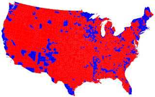
This image is a political pole by county on republican vs. democrat. Two color schemes to represent opposite data

http://www.nytimes.com/interactive/2008/09/04/business/20080907-metrics-graphic.html

This link is a really cool interactive bivariate choropleth on world spending.

unclassed choropleth


I got this image from http://gis.depaul.edu/shwang/teaching/geo381/LN9.htm as well. The map on the right is the unclassed choropleth map. It is the same as the classed map except with no explanation of what the variation in color is supposed to mean.

classed choropleth


I got this image from http://gis.depaul.edu/shwang/teaching/geo381/LN9.htm. This very helpful site also instructs on what a choropleth map can and cannot be used for. This classed map represent collegiate basketball players.

Monday, July 20, 2009

Range graded proportional circle map


The circles vary in size in accordance to population in the area. The pie charts within the circles represent workforce and non-specific types of work that a certain population does. So it is a continuously variable circle map with ranges of information.

DOQQ (Digital Orthographic Quarter-Quad)
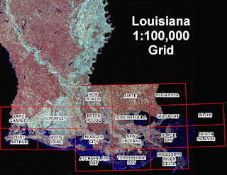

I found this DOQQ at www.lacoast.gov/maps/2005doqq/. This is an aerial photograph take of Louisiana after a hurricane. This is likely to assess the damage in quadrants.

DEM
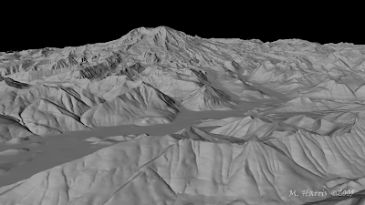

This is a DEM of Mt. Rainier that I found at www.highend3d.com/maya/tutorials/general/253.html. This mountain, in Washington State, keep snow at it's peak almost year round. Using this kind of map, all I can see is elevation but there are some areas toward the bottom where I can make out what is either a river or a road.

DLG


This is a DRG map that I found at vis.lbl.gov/.../waveref/files/chi1.htm. It shows geographic coordinates and also outlines the counties.

DRG


This DRG is a topographic map that I got out of my DeLorme book. This particular page is part of where I grew up. I actually grew up in a little spit of a town north of all that orange that represents the city of Spokane, Wa. These maps are perfect for traveling.

Isopleths


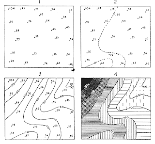
I got this tutorial map at www.fao.org/DOCREP/003/T0446E/T0446E06.htm. This tutorial explains how to find the primary isopleth values and draw the lines to connect. To finish off the isopleth map they add color in order to have more clarity in the depths.

Isopach


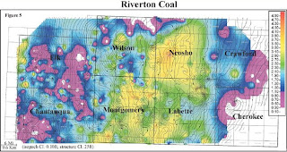
I got this image from www.kgs.ku.edu/PRS/Coal/riverton.html. It is a colored isopach image of coal distribution through this area. The area in yellow and near orange are the thickest deposits whereas the area in purlple is the thinnest.

Isohyets


I got this image of average rainfall per year in Washington State from http://content.lib.washington.edu/cmpweb/resources/map-rainfall.html. So many people don't believe me that half of this state is actually quite dry and I am from the dry side.

Isotachs


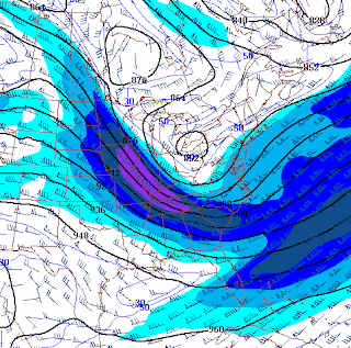
I found this map at www4.ncsu.edu/~nwsfo/storage/cases/20030123/ Not only is wind speed and direction given by the symbols but color is used to demonstrate wind velocity as well. Where the isobars are very close together the symbols and the color show very strong winds.

Isobars


This weather map show a nice mild summer in Australia. The isobars are atmospheric pressure indicators. The low pressure being at 1004 mb in the north-western corner. The closer the isobars are together, the stronger the wind speed.

LIDAR image


I just thought it was a really cool 3D image to show as an example of LIDAR. The website is a tutorial that shows what LIDAR is, how they get the images and what it can be used for. Site = http://www.csc.noaa.gov/products/sccoasts/html/tutlid.htm

Doppler radar


This is a doppler radar image of the infamous hurricane Katrina. The colors represent certain densities of rain or water saturation. The heaviest downpours are represented by red in this particular photo. I would imagine that the purple and the white would be flash-floods.

Black and white Aerial photo


I found this image at nature.sbc.edu/animals/beavers.html. The site suggests and shows that they are doing a nature study of species, especially beavers, in the area. Since location and abundance would need to be noted, color would be not only redundant but it would make for diffictult viewing.

Infrared aerial photo (deforestation)


This image that I found at http://www.mongabay.com/nasa_deforestation_imagery.html shows what infrared can reveal. The labels clearly show where healthy vegetation has been removed.

Infrared aerial photo


This a an infrared aerial photo of the Amazon river jungle. Healthy vegetation is very bright red. The white pieces in the upper left are clouds while a little bit of population can be seen in the crook of one bend of the river.

cartographic animation

This animation shows change in global climate. The animation stopped when I captured the image. This extremely overly long link shows many animations dealing with global climate.

http://images.google.com/imgres?imgurl=http://uwacadweb.uwyo.edu/JSHINKER/animations/global/gifs/nlwrs_web.gif&imgrefurl=http://uwacadweb.uwyo.edu/JSHINKER/animations/global/&usg=__QIbXN5ZVG3eE7-ogzERnV2Be0-8=&h=458&w=674&sz=224&hl=en&start=15&um=1&tbnid=L3lAljKs9w2rTM:&tbnh=94&tbnw=138&prev=/images%3Fq%3Dcartographic%2Banimations%26hl%3Den%26rlz%3D1G1GGLQ_ENUS335%26sa%3DG%26um%3D1

statistical map


Above is a statistical map based on population in the united states. Below is a statistical map that I got from www.env.go.jp. It shows world pollution of the top 13 polluting societies. The information contained in the map would not bevtoo shocking since these are also the most populated areas.

Cartograms


I got this image at www.ribbonfarm.com. It is a cartographic representation of population. Note how large India and Indonesia are compared to actual size in relation to the rest of the globe.

Flow map


I got this map from http://www.lib.utexas.edu/maps/texas/combtrk_tx_1998.jpg. Flow maps show where something is progressing to. It could be a disease or any kind of distribution pattern. It this case it is trucks going in and out of Texas.

Isoline maps

This is an isoline map where the lines are representative of constant values. I found this one at indimaps.com. I think these lines may represent a weather pattern.