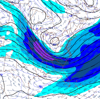
Sunday, August 2, 2009
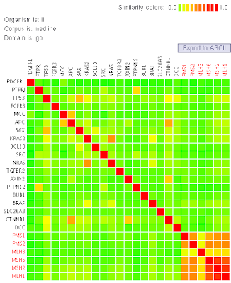
Simularity Matrix
I got this simularity matrix from http://tomcat.esat.kuleuven.be/txtgate/tutorial.jsp. This type of map is helpful in gene mapping and in determination of particular organisms.
Monday, July 27, 2009
Correlation matrix
C1 C2 C3 C4 C5 C6 C7 C8 C9 C10
C1 1.000
C2 0.274 1.000
C3 -0.134 -0.269 1.000
C4 0.201 -0.153 0.075 1.000
C5 -0.129 -0.166 0.278 -0.011 1.000
C6 -0.095 0.280 -0.348 -0.378 -0.009 1.000
C7 0.171 -0.122 0.288 0.086 0.193 0.002 1.000
C8 0.219 0.242 -0.380 -0.227 -0.551 0.324 -0.082 1.000
C9 0.518 0.238 0.002 0.082 -0.015 0.304 0.347 -0.013 1.000
C10 0.299 0.568 0.165 -0.122 -0.106 -0.169 0.243 0.014 0.352 1.000
This is an example of a random correlation matrix. These are common in scientific studies. There are two triangles in a correlation matrix
but that would be redundant to add since they are mirror images of one another.
Sunday, July 26, 2009
star plot
stem and leaf plots
Box Plot
I got this box-plot from http://www.krisweb.com/stream/habtyp.htm. I know it is difficult to see here but the explanation is the maximum and minimum depths of a variety of streams in the area in order to be suitable habitats for certain species of fish.
Histogram
Parallel coordinate graph
The airplanes will be represented with three broken lines connecting the X, Y, Z positions of each airplane. In addition, a fourth parallel coordinate representing time is provided. (We will show only three times associated with the initial time and the times the red airplane appears to cross the trajectories of the other two.) Y-axis values represent some physical position and time measures. I found this at http://www.caip.rutgers.edu/~peskin/epriRpt/ParallelCoords.html
triangular plot
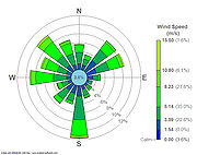
Windrose
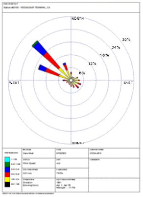
This Image is from Fresno, Ca airport. It is obvious that the winds are prevailing strongly to the NW. In the image below however, LeGuardia airport, the wind directions seem to be all over the place. They do prevail a bit to the south but otherwise a huge range of wind directions.
This is a windrose is from LeGuardia airport
Climograph
scatterplot
Population profile
Index Value plot
Accumulative line graph or Lorenz curve
bilateral graph
Nominal area choropleth
unstandardized choropleth
Standardized Choropleth map
Univariate Choropleth
Bivariate choropleth map
This image is a political pole by county on republican vs. democrat. Two color schemes to represent opposite data
http://www.nytimes.com/interactive/2008/09/04/business/20080907-metrics-graphic.html
This link is a really cool interactive bivariate choropleth on world spending.
unclassed choropleth
classed choropleth
Monday, July 20, 2009
Range graded proportional circle map
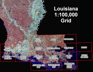
DOQQ (Digital Orthographic Quarter-Quad)
I found this DOQQ at www.lacoast.gov/maps/2005doqq/. This is an aerial photograph take of Louisiana after a hurricane. This is likely to assess the damage in quadrants.
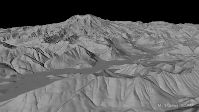
DEM
This is a DEM of Mt. Rainier that I found at www.highend3d.com/maya/
DLG
This is a DRG map that I found at vis.lbl.gov/.../
DRG
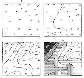
Isopleths
I got this tutorial map at www.fao.org/DOCREP/
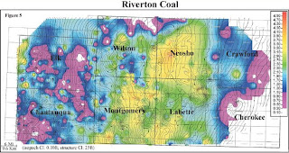
Isopach
I got this image from www.kgs.ku.edu/
Isohyets
Isotachs
I found this map at www4.ncsu.edu/~nwsfo/
Isobars
LIDAR image
Doppler radar
Black and white Aerial photo
I found this image at nature.sbc.edu/
Infrared aerial photo (deforestation)
Infrared aerial photo
cartographic animation
This animation shows change in global climate. The animation stopped when I captured the image. This extremely overly long link shows many animations dealing with global climate.
http://images.google.com/imgres?imgurl=http://uwacadweb.uwyo.edu/JSHINKER/animations/global/gifs/nlwrs_web.gif&imgrefurl=http://uwacadweb.uwyo.edu/JSHINKER/animations/global/&usg=__QIbXN5ZVG3eE7-ogzERnV2Be0-8=&h=458&w=674&sz=224&hl=en&start=15&um=1&tbnid=L3lAljKs9w2rTM:&tbnh=94&tbnw=138&prev=/images%3Fq%3Dcartographic%2Banimations%26hl%3Den%26rlz%3D1G1GGLQ_ENUS335%26sa%3DG%26um%3D1
statistical map
Cartograms
Flow map
Isoline maps
Tuesday, June 30, 2009
Proportional Circle maps
Monday, June 29, 2009
Choropleth map
Dot Distribution Map
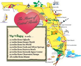
Propaganda Map
As you can see, everything is minutes from the "heart of Florida". These are EXACTLY things will see if you go to that exact spot. I think http://www.thevillagesvideooffer.com/aboutus/images/Florida-map-3-24-04.jpg wants us all to visit. Actually, this is a fun state, but maps like this are a little over the top because they have to be. Without attracting tourism there would not be revenue.
Hypsometric map
This is the "Lincoln/Lafayette trail. Notice the elevation lines! This was my most favorite hike EVER! I could not walk for a week afterwards because I was so sore, but it was worth it. Notice the "old man in the Mountain" on the mountain on the other side of the highway? I got a picture of it from the northwest corner of the trail before the old man fell off. I still want to do that hike again! I got this at Trails.com
Subscribe to:
Posts (Atom)